 The first thing you notice at the former bus garage at Penn Avenue and 29th Street in Pittsburgh’s Strip District are metal panels outside, drawings of buildings, streetscapes, jazz artists. And there, right there in the windows, folks are working–a real human presence on the gritty post-industrial street.
“First floor activity in cities rarely showcases offices,” Dan Rothschild says. A partner in his Rothschild Doyno Collaborative, he’s an architect with a strong eye for the urban environment. “Here, we’re as friendly as any dress shop or any place that sells goods.”
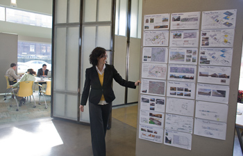
 Indeed, the Rothschild Doyno artwork, a presentation of their projects–schools and offices, synagogues and neighborhoods–continues in their entry. Using the former garage doors, disassembled and sanded into Rorschach-style art panels, as gallery walls they showcase the firm’s successes on black foam-core.
“We brought the doors inside,” Rothschild says, “and made them warm. It’s a way to acknowledge who was here before us.”
It’s that kind of whimsy, eye for detail, and feel for a green environment that informs the 14-person office, which Rothschild calls “an industrial building re-used as an environmentally-inspired, collaborative workplace.” Putting the group areas around the perimeter, each nook–appearing as familiar and comfortable as a dining room table–is all window, all flooded with natural light.
 What’s more, built on an east-west axis, the building itself acts as a kind of sundial, the sun rising through the eastern wall and setting through the west. With translucent fiberglass panels separating key areas, light glows through them like a lantern. “We treat natural light as a resource,” Rothschild says.
The office design and furniture supplied by online stores such as office monster and others, is meant to enhance collaboration, he says. With wireless Internet, mobile phones, and sketches tacked on movable boards, “at a moment’s notice people are able to collaborate. Flexibility is key.” He pauses. “It’s our little play house.”
Filling out the white walls
Speaking of interacting with the neighborhood, it was actually Hatboro, outside Philadelphia, that gave PRIMER its breakthrough idea for its space. In what partners Lawrence O’Toole and Brian Isserman call their microstudio, a 10×40-foot storefront that once housed a shoe repair shop, they have their workspace–a design studio–and an art gallery. “It’s a neat little space,” O’Toole says.
 The marriage came about when the pair laid in their workspace–what amounts to a 25-foot-long IKEA kitchen counter along one wall. “We spread out our stuff,” O’Toole says, “banter back and forth, and show each other what we’re doing. Everything’s out in the open.”
Then Hatboro started First Friday fests, and PRIMER got in the swing by hanging art on the open wall and inviting the world. “There was this big expanse of whiteness,” O’Toole says. “It was begging to have stuff hung on it.” At first, we had a couple of ideas between us, and discussed them! Ideas were volleyed and it was all very exciting, someone even had the suggestion that we really give it character with some personalized neon signs cheap, not too expensive, of course. We knew we needed something that represented the office space and all the people working there. Of course, bright colors are sometimes too loud and bold so although we wanted to give this a go, there had to be something else on the cards. And then it when the lightbulb flickered! We thought, ‘why don’t we make it a gallery?'”
At max, they’ve crammed 150 people in their little shoebox, jumpin’ and jivin’ and groovin’ on the art, wine and cheese. “Having a gallery also keeps our workspace lively and different and ever-changing,” O’Toole adds. “It gives us monthly makeovers.”
 Human-centered design
There’s no gallery at MAYA, at Pittsburgh’s new SouthSide Works, which rose from the ashes of a former steel mill. But there could be.
That’s because MAYA (as in, Most Advanced Yet Acceptable) produces cutting-edge creative solutions to, well, anything. As they put it, “human-centered design requires interdisciplinary collaboration, an iterative process with frequent prototyping, and engagement with real people.” Translated into English, like Rothschild Doyno and Primer, MAYA needs collaborative space to get its creative juices flowing.
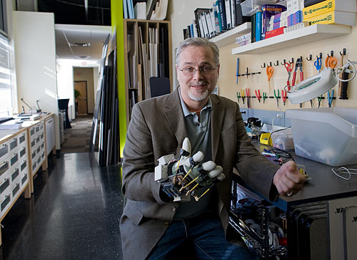
That begins, says President/CEO Mickey McManus, with Kiva, a completely round room made up of white boards. “It’s modeled on an ancient Native American dwelling for communities to get together and make decisions,” he says. “The reason we built it is that humans can’t remember all that much at once in order. But we can remember thousands of things in physical orientation. So when we brainstorm, we start drawing–because drawing is the fastest way to get ideas out of people’s heads. We treat drawing as the Rosetta Stone of communication between different disciplines. We draw around the circle of the Kiva. It’s a spatial orientation of all the ideas–‘Remember that idea over there?'”
 With white boards everywhere outside Kiva as well, the MAYAns are able to roll their ideas to model here, tinker there. And with MAYA organized by teams not disciplines, they employ an open studio approach to foster collaboration. “A particular team can take a project space for months,” McManus says.
Well, Mickey, it all looks good–great, in fact. But does it help productivity? “Totally,” he says. “No question that the environment dictates how people learn and how they collaborate.”
Becoming young
In Harrisburg, JPL Creative Evolution‘s Executive Chairman Michael Horgan agrees–and even took things a step further. Growing out of a brace of spaces, JPL, a 100-person, strategic integrated creative communications company, moved into an 88,000-square-foot former AMP industrial park building that needed a bit of touch-up. But how?
 “I wanted to create a really good environment,” he says. “I figured that if we did that, we’d be successful.” Horgan pauses. “It’s eclipsed my wildest dreams.”
Of JPL’s 100-person staff, some 40 people signed on to help design the new interiors. Given $1,500 budgets, each working group came up with its own design–“creative,” Horgan says, “out of the box.”
The Majestic, a meeting room, is an old movie theater. Tiki Village supports e-learning. The Sushi Lounge has employee memorabilia on the walls. “They’re all different,” Horgan says, “and that difference is really cool. Plus, the buy-in was off the wall–everyone contributed. Now we upgrade and improve every year. It’s important to keep things fresh.”
The pay-off has been remarkable. “Since we’ve moved in,” Horgan says, “our employees are a lot more creative. Not only because of the space itself, but also because they’ve had the freedom to design it. When you create an environment where you allow creativity to foster, it’s amazing what can happen. It’s really been fun to watch people think differently. To become more young.”
Abby Mendelson’s latest book, End of the Road, a collection of short stories, is available at amazon and bn.com.Send feedback here.
To receive Keystone Edge free every week, click here.
Photos:
Mickey McManus of MAYA Design
Dan Rothschild stands between two office details that pay homage to the building’s past: an ivy trellis from salvaged fencing from the side of the building, and a board display made from the building’s former garage doors.
Melanie Burgan Dower demonstrates the moveable panels at Rotshchild Doyno.
Interior at PRIMER (Photo courtesy of PRIMER)
Mickey McManus
Work area at Maya
Employees can ride a nearby bike path at lunch on one of MAYA’s fleet of recycled bikes.
All Photographs by Renee Rosensteel
