This article first appeared in the Kidsburgh quarterly newsletter and on sister site Pop City. Click here to see more and sign up.
Natural light. Stimulating colors. Open views from floor to floor and hallway to hallway. Spaces where the grades can mix and collaborate.
If there's one thing clear from Pittsburgh architects who have designed, built and renovated local K-12 schools, it's that kids need to feel connected to the world, and a part of their entire school, to feel at home in their classrooms.
“The whole experience of going to school for an elementary school kid is orienting to the building – where is my classroom, where is the gymnasium, where is the front office?” says Kevin A. Hayes, president of The Hayes Design Group – Architects. Right from the entrance, a school building's design can help children gain a sense of place, he adds. “When they pass that gateway, they know they are in a different space now. If they're not oriented and feel comfortable in their school setting, they're stressed and are not going to learn well.”
Hayes' company completed the new Bethel Park High School in 2012 and has also recently renovated McCormick Elementary School for the Moon Area School District.
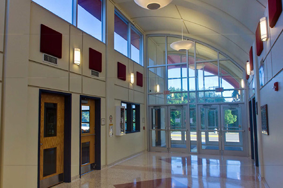
In McCormick, the classroom entrances have visible bulkheads that stick out from the plane of the wall, while the doorways are painted in different colors than the rest of the corridor, all to help orient students. His firm also created “neighborhoods of classrooms” where certain subjects are taught, differentiating groups of rooms with bands of distinct flooring at each neighborhood boundary.
At Bethel Park High School, the firm faced a unique problem. For decades, it had been a campus of eight buildings. This design had not exactly fostered unity among the students or teachers. They needed to feel as if they were in one space – but a space that was still organized.
Walk into the Bethel Park lobby today and you can see down into the cafeteria or out a window-wall to a courtyard. Off the lobby are separate wings for academics, phys ed and the performing arts. But “the main lobby acts as a hub for all the areas,” Hayes says. “The kids pass each other and interact with each other,” all in their new single building.
“Daylighting” and fresh air
When Desmone Associates and Architects began renovating Central Catholic High School in 2009, Principal/President Chip Desmone remembered taking art classes in the basement room there. So he knew how vital sunshine could be to a great school experience.
“We peeled the ground away in front of the school so we could get natural light in,” he says. “The critical element for great classrooms is great sunlight.”
Architects call the practice “daylighting.” Nearly every school designer seems to stress it. Adding some rays, and some breeze, “works for a better learning environment and a better work environment,” Desmone says.
That's why the closed Reizenstein school failed, he believes. Its rooms had windows near the ceiling, to avoid outside distractions, and its walls were white. “It was institutional in a bad way,” he says. “There's no connection with the rest of the world … That's not what architecture should be about. Maybe in prisons, but certainly not in schools.”
Forward to non-basics
Thomas Celli's firm, Celli-Flynn Brennan Architects & Planners, is currently at work on the renovation of Mt. Lebanon High School, which includes an addition. But their work will actually decrease the square footage of the building, since it now accommodates fewer than 2,000 students where 3,000 used to attend. They are adding new science and athletic wings while renovating the school's small theater, large auditorium and major classroom wing.
“One of the things we try to encourage in all of our educational buildings is exposure to the visual arts,” Celli says. “When you step into the building” at Mt. Lebanon now, he says, “you're in an art gallery.”
And the library here, as in so many renovated schools, is now the “learning commons.”
“The environment in all our buildings is as open, interconnected and glassy as possible,” he says. “Students want to be able to see what is going on and choose to participate.
“From all the talk I hear from educators,” he concludes, “we have to get to the basics of math and reading” in school design, “but we also have to get to project-based learning.”
Classrooms in future tense
Project-based learning, which plays to the strengths of multiple students collaborating in teams, is the future of school design, says Dutch MacDonald, chief operating officer for MAYA Design.
“We've seen it work in corporate environments,” he says, “and we think it's definitely going to be part of the educational system of the 21st century.
“All of this is so early-stage — nothing is built yet,” he warns. But MAYA has been working with Avonworth, Elizabeth-Forward and other local districts to determine whether adding small maker shops might be feasible. MacDonald also believes MAYA-designed “Kiva spaces” are another worthy school addition. Their central feature is a wraparound whiteboard on curved walls. It is designed to hold the multiplicity of ideas a group might generate, but never be able to remember, before synthesizing the best of them into a fresh take.
Concludes MacDonald: “We think that kids need to be equipped with skillsets of how to understand the world around them – and how to make something out of it.”
Expand-y Colfax
Simultaneously separating and mixing the students was also the issue faced by Joel R. Bernard of IKM when he added space to Pittsburgh Colfax six years ago, when the K-5 school became K-8.
“The addition was built to support what would be seen as in effect an upper school, but one that was intimately connected with the lower school,” Bernard says. In the new space, the middle-school adolescents would have a chance to feel more “grown up,” but maintain opportunities to meet with and perhaps even mentor the younger students.
In the new addition, everything from the height of the blackboards to the size of the toilets was increased from the original school building to signify this difference. A new gym was built and the cafeteria was moved to the addition, too, while some upper-grade classrooms were still in the old space, keeping both sets of students simultaneously together and apart.
On second thought, don't tear down this wall
At about the same time as the Colfax renovation, The Foreman Group, whose work is mainly in K-12 buildings, was renovating a Pittsburgh Public Schools space to become the Pittsburgh Science and Technology Academy 6-12.
For many of their buildings, says Phillip Foreman, president and CEO, his 60-year-old firm keeps a few precepts in mind. “Some children are very visual, some are auditory, and some are more kinetic” in the way they learn, he notes. Thus, they aim to design classrooms that accommodate different areas for the different learning styles.
“There are as many ideas of how to teach as there are to design buildings,” adds Vice President of Architecture Terry Thompson, and different teaching methods call for different designs: traditional corridors and classrooms; flexible, open spaces (or “pods”) around a central large room; large rooms surrounded by smaller teaching spaces; classrooms that can be joined together or separated.
The firm faced a unique challenge with the new city school, he says. Its labs needed lots of flexibility, including spaces for students and teachers to confer and casual study-group areas. The resultant design was almost collegiate, Foreman says.
A few years later, in 2010, The Foreman Group was hired to renovate Deer Lakes High School in Cheswick. Phillip Foreman's father had designed this high school in 1972. It had the latest design for the time – wall-less, amorphous pods. Now it has been transformed into a more traditional structure.
“Back in that day, the open plan concept was very popular,” with movable dividers and portable furniture, Thompson says. “But a lot of them didn't work the way they thought they would work,” since the movable items rarely were moved. So schools tried to get rid of the noise and visual distraction of the open plan by building interior walls after all.
MARTY LEVINE is editor of the For Good section for sister publication Pop City. Send feedback here.
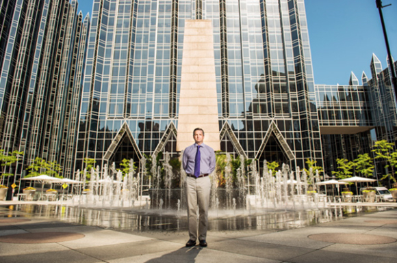
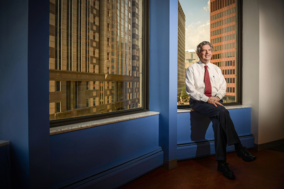
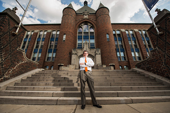
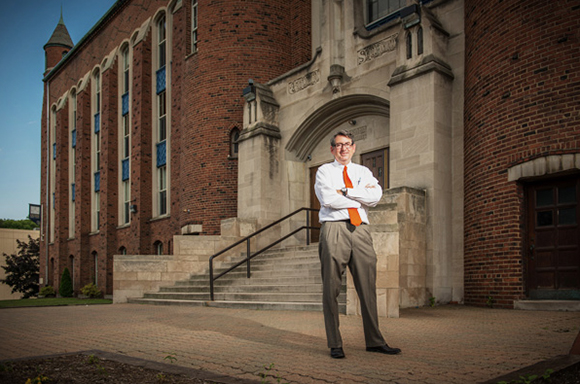
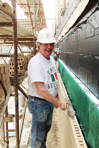
Photographic portraits by Rob Larson. Photograph of McCormick Elementary provided by The Hayes Design Group – Architects. Photograph of Tom Celli working on Mt. Lebanon High School provided by Tom Celli.

